Pep Carrio


Experimenting
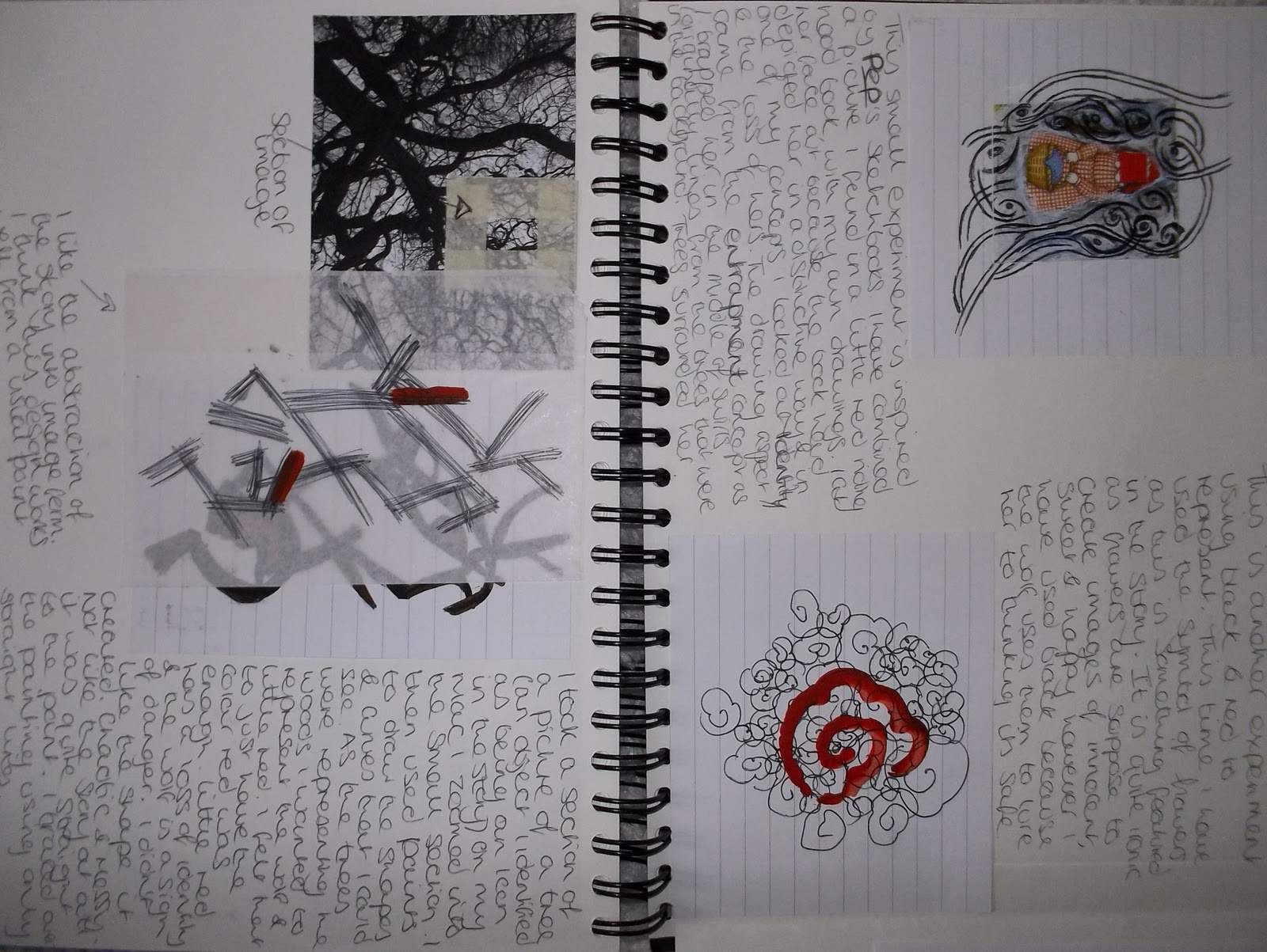 I decided to experiment in small scale, inspired by Pep Carrio's Sketchbooks. I have used the Red to represent Red riding hood's identity. A figure doesn't need to be present, because in the story it is only made clear that the character is there by describing what she is wearing. I have looked at using the icons of the story and playing with them. The flowers that she is told to pick represent's innocence, the trees are an icon and I've looked at abstracting them, turning it into a line drawing. I think the simplicity of these experiments is something I would like to use and develop further. The abstracted trees and the picture and circle I feel work with the colours well and have an impact.

Vicky Scott


The person and objects are depicted in a white/grey and the colour is mainly injected by the clothes & background. This relates to my concept of identity where as the persons identity isn't the main focus, much like Little Red Cap's. My brief is to present the viewer with the impact of the colours in the story and I think that using a small colour palette creates more of an impact, as shown in these works.

Experimenting
 Using Scott work for inspiration, I have taken my primary images, put them in black and white and used a colour background. I don't think this is as effective as the last experiments. I tryed having the colour in the object and a pure black background. I prefer this look, but it doesn't work as well for the brief.
Stephanie Dotson

Dotson's work looks as though it could be small scale collages, but in fact they are large scale installation pieces. I love the scale ability of her work and how it's looks as good photographed and printed on paper in a book, as it would if seen installed. I am interested in particular in the technique of layering and the use of colours in the pieces. She has designed using only a few colours and carefully positioned the colours to emphasise and compliment each other.
Layers experiment

I thought that I could create outlines of the icons in the story and experiment with layering them. I looked at creating the identity of little red cap first. Tracing over a primary image of a figure I experiment with have to create a figure that has no identity. I then san this in and created a few outline of other icons but i could see straight away that this wasn't going to work in answering the brief. So I left this one.
Layering
This is one of my experimentation’s with my icon concept. I took primary photographs of icons i had associated with Little Red Cap, I then cut them into circles and layered them, inspired by the work of Stephanie Dotson. I wanted the colour scheme to be greytones to show the dark side of the tale, with red as the only colour.

Finalising

Using the circle piece I created before, I cut 9 smaller circles from it so it became abstracted. It lost the impact of the colours so I thought about drawing over it and scanning those into photoshop where I could add a red background. I didn't like the hand quality of the drawing so I decided to take the circles into illustrator, make a live trace and then add a red background.

Further Development


I went back to Pep Carrios work and simplicity and experimented more. The circles is a circle for each time red needs to be represented in the story, danger, Wolf, Red Cap.
No comments:
Post a Comment